Toothpics()
Example 1: Basic ideas and comparisons
Example 3: Other than log-scaling
Example 4: How large can N be in a group?
Example 5: A 2 x 2 factorial design
Example 1: Basic ideas and comparisons
Example 3: Other than log-scaling
Example 4: How large can N be in a group?
Example 5: A 2 x 2 factorial design
Example 2: Log-scaling works!
The problems epitomized by detonator plots (Example 1) are still endemic across the sciences. Zaloumis, Fowkes, De Livera, and Simpson (2015) decried this under the superb title, "Presenting parasitological data: the good, the bad and the error bar" (Parasitology, 142:1351–1363). Consider their Figure 9, which they present as a bad way to visually compare pregnant women infected with malaria (93 cases) versus pregnant women not infected (224 controls). The Y measure was immunoglobulin G (IgG) titre in response to antigen Pf merozoite. (I have no subject-matter expertise here.)
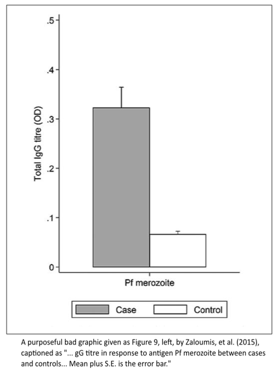
This plot shows only two sample means and two sample standard errors. No data. No confidence intervals. Why is the X-axis labeled "Pf merozoite?" Can the legend be scrapped by using a better, simpler design?
The article included a link to supplemental material, which included the dataset that gave rise to their Figure 9. So I embedded those data within the Rfunc file for Toothpics(). Because Example 2a uses log(Y), all values below 0.005 (3 infected cases, 13 not infected) were reset (Winsorized) to 0.005.
The windows receiving the graphics were created using
PlotDirector(PlotSize=list(w=5, h=5), CloseOld=TRUE)
Example 2a
The data were jittered using
Total.IgG.jit <- FitterJitter(Y=Total.IgG.titre.OD, Groups=Malaria)$y.jit
Note the specification, Factor=3, which triples the minimal jitter gap in order to spread out the many observations near 0.00.
Toothpics() statement, Graphic 2a
Toothpics(
Title="Total IgG Titre in\nResponse to Antigen Pf Merozoite",
Y=Total.IgG.jit,
Group=Malaria,
GroupLevels=c("Case","Control"), # Required!
RawY=Total.IgG.titre.OD,
YLabel="Total IgG titre (OD)",
YTickDigits=2,
GroupNames=c("Infected","Not Infected"),
Quantiles=c(0.20, 0.50, 0.80),
QPrint=FALSE,
MQDigits=3
)
Graphic 2a
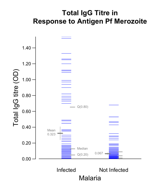
Toothpics() graphic 2a.
Even with the sophisticated jittering done by FitterJitter(... Factor=3), there are so many observations near Y = 0 that they are not individually discernible. In fact, it seems that there are at least as many infected cases as not infected controls. As with many biological measures, total IgG titre (OD) is heavily right skewed. It may also be a variable for which 0.40 versus 0.20 is a much larger difference than, say, 1.40 versus 1.20: 0.40/0.20 = 2.00 versus 1.40/1.20 = 1.17. Let's see how using log(Y) leads to telling a more straightforward story.
Example 2b
The jittering used
Total.IgG.logjit <- FitterJitter(Y=Total.IgG.titre.OD, Groups=Malaria,
LogY=TRUE, Factor=3)$y.jit
Toothpics() statements, Graphic 2b
Toothpics(
Title="Total IgG Titre in\nResponse to Antigen Pf Merozoite",
Y=Total.IgG.logjit,
RawY=Total.IgG.titre.OD,
YLabel=" Total IgG titre\n (OD; log scaling)",
LogY=TRUE, # a better perspective!
YTicksAt=c(0.005, 0.01, 0.025, 0.05, 0.10, 0.25, 0.50, 1.0, 2.0),
YTickLabels=c("0.005", "0.010", "0.025", "0.05", "0.10", "0.25", "0.50",
"1.00", "2.00"),
Group=Malaria,
GroupLevels=c("Case","Control"), # Required!
GroupNames=c("Infected","Not Infected"),
Quantiles=c(0.20, 0.50, 0.80),
MQDigits=3,
YLabelMoveRight=-0.3
)
Graphic 2b
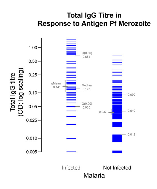
Toothpics() graphic 2b.
Within a few seconds of viewing, this graphic reveals the results in a truthful way that can be more easily comprehended by more people than relying on conventional statistical computations.
However, for completeness and rigor, what analysis dovetails with this graphic?
Analysis based on log(Total IgG titre) to assess ratio of geometric means
The following code and R's response to it give us the estimate and 95% confidence interval for the ratio of the two geometric means, gMean(infected)/gMean(not infected). From Graphic2b, the estimate is 0.141/0.037 = 3.81. The CI stems from applying the Welch t-test, which avoids the assumption of equal variances.
> (ttest.2b <- t.test(log(Total.IgG.titre.OD) ~ Malaria))
Welch Two Sample t-test
data: log(Total.IgG.titre.OD) by Malaria
t = 8.0647, df = 136.72, p-value = 3.309e-13
alternative hypothesis: true difference in means is not equal to 0
95 percent confidence interval:
1.000573 1.650654
sample estimates:
mean in group Case mean in group Control
-1.961990 -3.287604
> names(ttest.2b)
[1] "statistic" "parameter" "p.value" "conf.int" "estimate" "null.value"
[7] "alternative" "method" "data.name"
> exp(ttest.2b$estimate) # equates to gMeans in graphic 2b
mean in group Case mean in group Control
0.14057840 0.03734323
> exp(ttest.2b$estimate[1] - ttest.2b$estimate[2]) # ratio of gMeans
mean in group Case
3.764495
> exp(ttest.2b$conf.int) # 95% CI for ratio of gMeans, Welch-t method
[1] 2.719840 5.210389
attr(,"conf.level")
[1] 0.95
In summary, the estimated ratio of the geometric means is 0.141/0.037 = 3.8 with a 95% CI of [2.7, 5.2]. Graphic 2b supports this completely. What could be more straightforward? (In my opinion, the traditional null hypothesis has no credence. Why would the immune functions of those infected with malaria be exactly the same as for those not infected,? Accordingly the P-value--in this example, P < 0.0000000000001--is of no probative value, as is true almost all the time in non-randomized studies and even the majority of the time in experimental, randomized studies.)
Then again, let me ask: Is comparing the groups' central tendencies the best statistical focus?
