Toothpics()
Example 1: Basic ideas and comparisons
Example 2: Log-scaling works!
Example 3: Other than log-scaling
Example 4: How large can N be in a group?
Example 1: Basic ideas and comparisons
Example 2: Log-scaling works!
Example 3: Other than log-scaling
Example 4: How large can N be in a group?
Example 5: A 2 x 2 factorial design
This is the most complex of the Toothpics() examples. This fictitious story aims to :
- Review linear modeling in which log(Y) is the outcome measure. First, log(Y) often gives a scaling that better reflects the underlying physical/biological mechanisms of what Y is measuring. Second, analyzing log(Y) can lead to more direct, simpler interpretations than using Y.
- Demonstrate how to set-up Toothpics() when the Groups are better compared visually with unequal spacing.
2 x 2 factorial design with factors:
- Treatment, "Usual" therapy vs. "Z82," the experimental therapy. Z82 will be less expensive to produce, store, and deliver than the usual therapy. This small preclinical study is only a first step in this March of Science.
- Gender, ("f") female and ("m") male.
Outcome measure:
- "demingase," a (fictitious) enzyme involved in regulating platelet production.
Subjects:
- knockout mice created to have deficient demingase levels, so these therapies are supposed to increase and maintain demingase serum levels.
No baseline measure:
- The demingase assay is expensive and there is so little variation among such rats at baseline that having baseline demingase measures would be little use anyway.
The code given in the Rfunc creates a data set in which demingase (D) is logNormal in distribution (before rounding). After discussing this study with Mother Nature, I gave Z82 higher values for both genders (solid Treatment main effect), but this is moderated by a pronounced "crossover" Treatment by Gender interaction.
Analysis:
- common saturated 2 x 2 linear model (ANOVA with both main effects and the interaction) with Y = log(demingase). Estimates of coefficients (beta weights) are exponentiated in order to directly interpret the effects as ratios of geometric means.
As always, I worked to make the R code as literate as I could. Given here are only the FitterJitter(), PlotDirector(), and Toothpics() statements that produced graphic. Note that I used GroupSpacing= and the "long form" of TPColor=.
Statements for Graphic 5
demingase.jit <- FitterJitter(Y=demingase, LogY=TRUE, Groups=TrtmntGend)$y.jit
PlotDirector(PlotSize=list(w=6.5, h=6), CloseOld=TRUE)
Toothpics(
Title = "Does Z28 promote demingase production?\na 2 x 2 design",
Y=demingase.jit,
RawY=demingase,
LogY=TRUE,
YLabel="Serum Demingase (U/L; log scaled)",
Group=TrtmntGend,
GroupLabel="",
GroupLevels=c("Z82.f","Z82.m","Usual.f","Usual.m"),
GroupNames=c("Z82,\nFemale","Z82,\nMale","Usual,\nFemale","Usual,\nMale"),
GroupSpacing=c(1.0,1.7,3.5,4.2),
TPLength=0.5,
RelFontSize=c(1,1,0.9,1,0.9,1),
TPColor = c("red","blue","red","blue"),
YTicksAt=seq(80,200,20)
)
Graphic 5
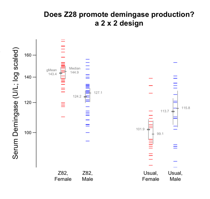
Graphic 5.
