Example 1: Basic ideas and comparisons
Example 2: Log-scaling works!
Example 3: Other than log-scaling
Example 4: How large can N be in a group?
Example 5: A 2 x 2 factorial design
Example 2: Log-scaling works!
Example 3: Other than log-scaling
Example 4: How large can N be in a group?
Example 5: A 2 x 2 factorial design
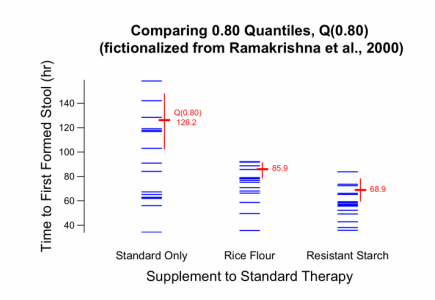 Graph created for Example 1b, discussed below.
Toothpics()
Download current version of Toothpics().
I also recommend you download FitterJitter() and PlotDirector(), which are used in the examples herein.
Plots a continuous Y variable versus a nominal Group variable. The plotting symbol is a thin line—like a flat toothpick viewed from the side—which enables a large number of Y values to be individually discerned and facilitates group comparisons.
This Rfunc is guided by the timeless principles for excellence in data graphics that Edward Tufte advocated in 1983 with his seminal book, The Visual Display of Quantitative Information, (now in 2nd Ed.) Graphics Press, Cheshire, Connecticut.
Toothpics() works in synergy with the Rfuncs FitterJittter() and PlotDirector(), which are required to run the examples herein.
- Current release is downloadable below. (Every Rfunc has a data stamp of YYMMDD. Thus, 160513 = 2016 May 13.)
- The only cross-platform issue is that in my Linux set-up (which I run via VirtualBox on a Mac), a few of the on-screen graphics window sizes set by PlotDirector() are not quite large enough to build the full Toothpics() image. All you need to do is enlarge the window a bit, either by hand or by changing PlotSize= in PlotDirector(). Other Linux set-ups may not need this.
Arguments
Title = "" {="Your plot title"}
*** Required ***
Y
Group
GroupLevels = c("value1", "value2", ...)
*** Y ***
RawY = NA
LogY = FALSE
YLabel = NA {= "Your label for Y axis"}
YLabelMoveRight = 0 {= value }
YAxisLimits = "range" {= "common"; = c(value.lo, value.hi)}
YAxisStretch = c(0.005, 0.005)
YTicksAt = NA {= c(value1, value2, ...}
YTickLabels = NA {= c("label1","label2", ...}
YTickDigits = NA {= value}
YValuesVertical = FALSE
*** Group ***
GroupLabel = NA {= "Your label for Group axis"}
GroupLabelMoveUp = 0 {= value}
GroupNames = NA {= c("name1", "name2", ...)}
GroupSpacing = NA
*** Means ***
PlotMeans = TRUE
MeanPrint = TRUE
PlotMeanCIs = 0.95 {or other level}
MeanValues = NA {= c("mean1", "mean2", ..., "meanG")}
MeanColor = "gray50" {= "other color"}
*** Quantiles ***
Quantiles = 0.50 {= c(tau1, tau2, ...}
QPrint = TRUE
PlotQCIs = NULL {= level; = NA}
QValues = NA {= c(set of character values)}
QuantileColor = "gray50" {= "other color"}
*** Both Means and Quantiles ***
MQdigits = NA {= value}
MQKeyGroup = 1 {= other group number}
*** Toothpics ***
TPLength = 1 {= other value}
TPThickness = 1 {= other value}
TPColor = "blue" {= "other color"}
*** Font Sizes ***
RelFontSize = c(1, 1, 1, 1, 1, 1)
(2) GroupLabel
(3) GroupNames
(4) YLabel
(5) YTickLabels
(6) mean and quantile values next to those markers
Objects Returned
None. Instead, Toothpics() builds a plot in whatever graphics device is currently open. To build the plot in an external window or build a graphics file in PDF, JPG, PNG, or SVG format, use the Rfunc PlotDirector().
Title = "" {="Your plot title"}
- Title to appear centered above plot. May use "\n" to begin new line. Works with RelFontSize=.
*** Required ***
Y
- Numeric outcome variable, perhaps already jittered within each group by FitterJitter(), which preserves group means.
Group
- The group variable, character or factor.
GroupLevels = c("value1", "value2", ...)
- Levels of Group= variable, in order of how they will appear in plot. Only those levels will be plotted.
*** Y ***
RawY = NA
- Although FitterJitter() preserves the sample means on Y, the quantile estimates and the confidence intervals for both means and quantiles can be affected. Supplying the original (un-jittered) Y with RawY= sets it to be used instead of Y= in those computations. Of course, RawY and Y must be identical except for those values that were jittered. See Examples.
LogY = FALSE
- LogY=TRUE employs log-scaling of Y axis, but retains tick values in Y units.
YLabel = NA {= "Your label for Y axis"}
- Label for Y axis. If NA, Toothpics uses the name of the Y= variable. For no Y label, use YLabel="". Works with RelFontSize=.
YLabelMoveRight = 0 {= value }
- Number of typeset lines to move Y-axis label to the right. Negative value moves Y-axis label to the left. Value may be fractional. Thus, YLabelMoveRight = -0.3 moves the Y label 0.3 lines left to widen the gap between it and the Y tick values.
YAxisLimits = "range" {= "common"; = c(value.lo, value.hi)}
- ="range" (Tufte's "range frame") sets limits at min(Y) and max(Y), however, by default, YAxisStretch=c(0.005,0.005) expands the limits by 0.5% in each direction.
- ="common" sets limits at whatever YTick values are nearest to but below min(Y) and above max(Y).
- =c(value1, value2) sets limits at those specific values.
YAxisStretch = c(0.005, 0.005)
- With YAxisLimits="range", the default of YAxisStretch=c(0.005, 0.005) stretches the Y-axis limits 0.5% in each direction. YAxisStretch=c(0.005, 0.01) stretches the upper limit by 1%. This argument rarely needs changing, but is there to assure that thick toothpics can be fully drawn at the min(Y) and max(Y) limits. All examples use the default.
YTicksAt = NA {= c(value1, value2, ...}
- Specific tick points for Y axis, such as YTicksAt = c(0, 2.5, 5, 7.5, 10) or, equivalently, YTicksAt = seq(0,10,2.5). YTicksAt=NA sets the ticks by algorithm. Often works with YTickLabels=.
YTickLabels = NA {= c("label1","label2", ...}
- Using YTickLabels = c("label1","label2", ...) sets custom tick labels for the Y axis. Must be same length as YTicksAt=. YTickLabels is specially useful if Y is analyzed after transforming it, but you want to use tick values that relate to the usual/original Y.
- In Example 3, Y is a proportion (0 < Y < 1) that is unrelated to the binomial distribution, and the logit transform, log(Y/(1-Y)), is used for analysis. Viewers will appreciate seeing values expressed in proportions, e.g., {0.10, 0.30, 0.50, 0.70, 0.90}, even when they are unequally spaced visually.
YTickDigits = NA {= value}
- Number of digits to right of decimal point for Y tick values. YTickDigits =NA sets YTickDigits= by algorithm. Ignored if YTickLabels= is used. If LogY=TRUE and YTicksAt=NA, YTickDigits may need to be automatically increased in order to avoid a rounded lower limit of 0.00.
YValuesVertical = FALSE
- =TRUE makes tick values on Y axis vertical. Recommended for use only when necessary.
*** Group ***
GroupLabel = NA {= "Your label for Group axis"}
- Label for Group axis. If NA, Toothpics() uses the name of the Group= variable. For no Group label, use GroupLabel="".
GroupLabelMoveUp = 0 {= value}
- number of lines to move GroupLabel= up. <0 to move down. May be fractional.
GroupNames = NA {= c("name1", "name2", ...)}
- Custom names for groups ordered as per GroupLevels. GroupNames=NA set the group names to the same as values in GroupLevels=.
GroupSpacing = NA
- =NA spaces the groups evenly at X = 1, 2, ...
- To space unevenly, use GroupSpacing=c(x1, x2, ...).
- As per Example #5, consider a 2 x 2 factorial design with GroupLevels=c("A1B1", "A1B2", "A2B1", "A2B2"), where A1 vs. A2 is the focal main effect. Using GroupSpacing=c(1.0, 1.7, 3.5, 4.2) clusters the two A1 groups away from the two A2 groups (to better visualize the A main effect), and puts the B1 and B2 group side by side, showing how they compare within A1 and A2, thereby showing the extent of possible AxB interaction.
*** Means ***
PlotMeans = TRUE
- To mark each group mean. PlotMeans=FALSE suppresses marking the means.
MeanPrint = TRUE
- MeanPrint = FALSE suppresses printing values of sample means next to mean marks. Not used if PlotMeans = FALSE.
PlotMeanCIs = 0.95 {or other level}
- To plot t-based (Normal=theory) CIs for each group at specified confidence level. To suppress, use PlotMeanCIs=NA.
MeanValues = NA {= c("mean1", "mean2", ..., "meanG")}
- To specify text for mean values to be printed verbatim at the mean marks for the G groups, use
MeanValues=c("mean1", "mean2", ..., "meanG") - MeanValues must have same length and order as GroupLevels=. See Example 3.
MeanColor = "gray50" {= "other color"}
- Color of mean marks, values, and confidence intervals. See remarks about choosing colors at TPcolor=.
- See below for remarks about choosing colors.
*** Quantiles ***
Quantiles = 0.50 {= c(tau1, tau2, ...}
- Quantiles = c(tau1, tau2,..) marks one or more of the groups' quantiles, estimated using the Harrell-Davis method described in the Rfunc HDquantile(). For example, Quantiles=c(0.20, 0.50, 0.80) marks the 20th, 50th (the median), and 80th percentiles for each group. Works with PlotQCIs=.
QPrint = TRUE
- QPrint = FALSE suppresses printing values of quantiles next to quantile marks. Not used if Quantiles = NA.
PlotQCIs = NULL {= level; = NA}
- For example, PlotQCIs = 0.90 displays 90% CIs for a single quantile specified by Quantiles= above.
- To suppress, use PlotQCIs = NA.
- When PlotQCIs = NULL, if length(Quantiles) == 1, then PlotQCIs behaves as if PlotQCIs = 0.95.
QValues = NA {= c(set of character values)}
- To specify text for quantile values to be printed verbatim for the G groups and Q quantiles, use
QValues = c("q11", "q12", .... "q1Q",
"q21", "q22", .... "q2Q",
...
"qG1", "q22", .... "qGQ") - The Q values across each row must be ordered lowest to highest and be the same length as Quantiles=. The rows must in the same order as GroupLevels and GroupNames. This suppresses computing CIs for the quantiles. See Example 3.
QuantileColor = "gray50" {= "other color"}
- Color of quantile marks, values, and confidence intervals. See remarks about choosing colors at TPcolor=.
- See below for remarks about choosing colors.
*** Both Means and Quantiles ***
MQdigits = NA {= value}
- Number of digits to right of decimal point for plotted text giving values of means and/or quantiles. MQdigits = NA (default) uses algorithm in the internal function FitterFormat() to give 3 significant digits for values <1000: 12345, 1234, 123, 12.3, 1.23, 0.123, 0.0123, 0.00123.
MQKeyGroup = 1 {= other group number}
- Designates which group will get tagged with "Mean" (or "gMean") and/or "Median" and "Q(0.xx)" labeling. (This avoids the need for an annoying plot legend.)
*** Toothpics ***
TPLength = 1 {= other value}
- Relative length of toothpics, e.g., TPLength=0.70 gives 70% of standard length; 1.5 gives 150% of standard length.
TPThickness = 1 {= other value}
- The thickness of the toothpics is set according the largest group sample size. But it can be changed relative to that. For example, TPThickness = 0.50 cuts the thickness in half. TPThickness = 2.0 doubles it.
TPColor = "blue" {= "other color"}
- If only one color is specified, all groups will be that color. Otherwise, specify the color for each group in the same order as GroupLevels=.
- Example 5 deals with a 2 x 2 factorial design. By using TPColor=c("red","blue""red", "blue"), the female groups (#1, #3) are red, and the male groups (#2, #4) are blue.
- See below for remarks about choosing colors.
*** Font Sizes ***
RelFontSize = c(1, 1, 1, 1, 1, 1)
- Relative font sizes for
(2) GroupLabel
(3) GroupNames
(4) YLabel
(5) YTickLabels
(6) mean and quantile values next to those markers
- For example, RelFontSize=c(1, 0.8, 0.6, 0.8, 0.6, 1) reduces the fontsizes associated with the Group and Y axes, but does not change the size of the Title or the mean and/or quantile values.
Objects Returned
None. Instead, Toothpics() builds a plot in whatever graphics device is currently open. To build the plot in an external window or build a graphics file in PDF, JPG, PNG, or SVG format, use the Rfunc PlotDirector().
On Choosing Colors
- The 8 colors of the core palette are "black", "red", "green3", "blue", "cyan", "magenta",
"yellow", "gray". To see all 657 colors that R recognizes, execute colors(). - According to Tufte, choose colors "so that the color-deficient and color-blind (5 to 10 percent of viewers) can make sense of the graphic. Blue can be distinguished from other colors by most color-deficient people." I concur, hence, TPColor = "blue" is the default.
- Be prudent and remember that colored images will likely be printed on paper as shades of gray.
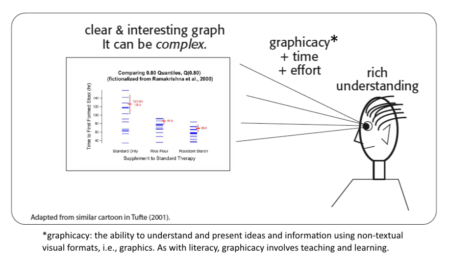
Show the Data! Tufte principles (with my renderings).
Statistical scientists must communicate with clarity, precision, and efficiency. This includes developing excellent statistical graphics, and doing so well takes skill, time, and discipline. We can always do better. In The Visual Display of Quantitative Information, Edward Tufte stresses that such graphics should:
Statistical scientists must communicate with clarity, precision, and efficiency. This includes developing excellent statistical graphics, and doing so well takes skill, time, and discipline. We can always do better. In The Visual Display of Quantitative Information, Edward Tufte stresses that such graphics should:
- "Above all else, show the data." Do so in ways that truthfully reveal what the data have to say. "Indeed," Tufte wrote, "graphics can be more precise and revealing than conventional statistical computations." This point covers Tufte's overarching principle.
- Maximize the data:ink ratio, the proportion of a graphic's ink/pixels devoted to data and statistical information. This implies minimizing unnecessary ink, especially "chart-junk."
- Structure the graph to make it easy to see relationships among variables, such as how an outcome measure (Y) varies among different groups, the focus of Toothpics().
- Reveal both micro and macro characteristics. Micro: individual data values. Macro: summary statistics such as means, medians. quantiles (percentiles), and associated confidence intervals.
- Work in synergy with the verbal material, especially with the statistical analyses and resulting conclusions.
- Motivate the viewer to take the time necessary to gain a richer understanding of the data than they could ever get by looking over raw data values or statistical analyses. Humans have an extraordinary innate ability to process visual information quickly and to retain the image.
- Accurately depict each variable's scaling characteristics. When plotting a variable's values, its dimension/axis should be scaled according to what that variable quantifies and to how it is used in the data analysis. Thus, in most cases, when log(Y) is used for analysis, the Y-axis should be log-scaled. This includes ratio comparison measures. such as Y.post/Y.pre. Even experienced, professional statisticians "forget" that when such measures are left as is (not logged), 4/5 = 0.80 is not the opposite of 5/4 = 1.25.
- Stand on its own and be "friendly" to read. As much as possible, the graphic should spell out words and make them run left to right. Little message can help, such as noting which direction of an outcome variable is "better" versus "worse.
Toothpics()
Example 1: Basic ideas and comparisons
Example 2: Log-scaling works!
Example 3: Other than log-scaling
Example 4: How large can N be in a group?
Example 5: A 2 x 2 factorial design
Example 1: Basic ideas and comparisons
Example 2: Log-scaling works!
Example 3: Other than log-scaling
Example 4: How large can N be in a group?
Example 5: A 2 x 2 factorial design
